
Standard Page Properties
Learn about subtitles and more!
Each Configuration Field in Detail
General Tab
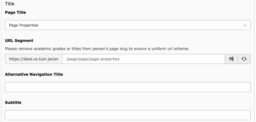
- Page Title
The title of you page. It will appear in the hero section of the page, in the menus listint the page and in the tab title of your browser.
- URL Segment
The URL of you page.
Typo3 takes care of generating a search engine friendly and human readable URL.
However, sometimes you'd want to edit the so called “slug”. To do this, click on the eye/chain symbol to activate the field and then do your edits, like removing "prof-dr-" from a professor’s page URL.
If you change the page title, you may hit the reload button far right to update the slug.
- Alternative Navigation Title
The value of this field will appear in menus instead of the page title.
This is handy if you have a long title.
- Subtitle
The subtitle will appear in a slighty smaller font below the page title in the Hero section.
An example is given in the hero of this page.
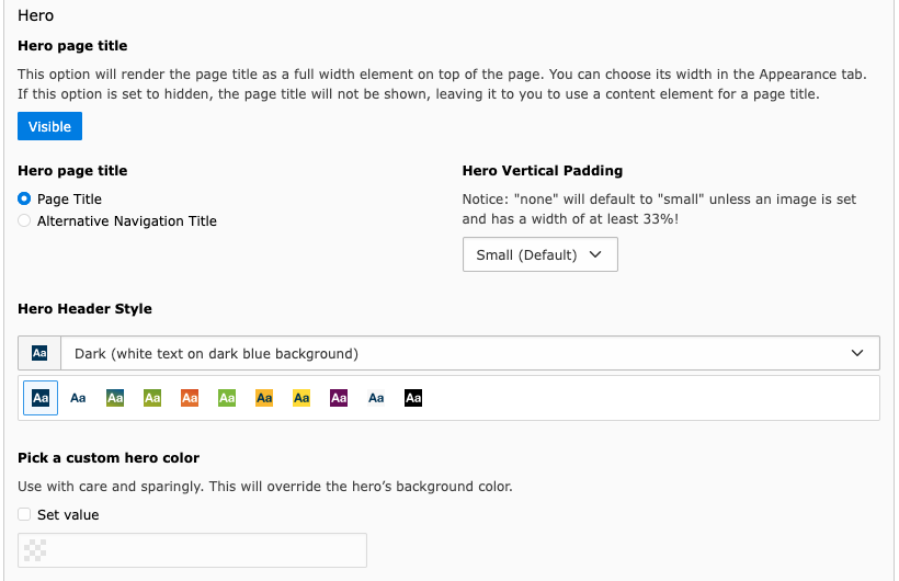
- Hero Page Title
This toggle switch decides whether your page will feature the Hero section which is a full width colored area between the main navigation and the page content. It contains the breadcrumbs navigation (optional), title, subtitle (optional), and an image (optional).
By default, the Hero section is visible.
- Hero title source
Choose whether the Page Title or the Alternative Navigation Title should be shown in the Hero.
- Hero vertical padding
This sets the height of the section above and below the hero’s contents.
Set to none if you want to use an image and want it to be flush with the header and main section.
- Hero Header Style
Choose one of the preset color themes for the Hero.
Colors may be used at own descretion, but as it goes some standards have evolved:
- Dark: Default, for TUM-related pages
- TUMCS Gradient Green to Blue: Research-related pages
- HSWT Green: HSWT-professorships (not mandatory)
- Master: addressing Master studies
- Bachelor: addressing Bachelor studies
- Students: stud.cs.tum.de
- Black: Documentation
- Pick a custom hero color
You may also pick a color by yourself. It will override the background color of the Hero Style chosen above.
Please select a matching Hero style for appropriate font colors, i.e. Light for light custom colors and dark for dark custom colors.
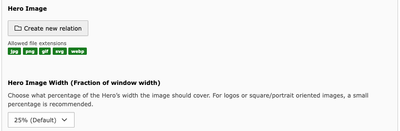
- Hero Image
Select an image to display on the right side of the hero section.
- Hero Image Width
Choose what percentage of the Hero’s width the image should cover.
The image will be scaled retaining its aspect ratio.
For logos or square/portrait oriented images, a small percentage is recommended.
SEO Tab
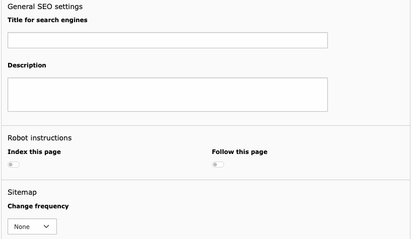
- Title for search engines
This field is used for the
<title>...</title>tag of your web page. This title is used in the search results of search engines. There are some best practices for the value of this field.- Use a speaking title, which targets your audience
- If possible, use the keywords you want to be found on in the title
- Please make sure your title fits in a Google Snippet. You can use third party extensions to help you with this.
When no value for the Title for search engines field is defined, it will have a fallback to the field Page title. It will show the page title in the search results in that case.
- Description
The description field is important for SEO purposes. This field is used to instruct search engines to use this text to show as a teaser of your page in the search result snippets. With this description, you can give the user a clear overview of the topic of this page.
It is best practice to use at least the keywords you want to be found on in this description. Make sure the description is not too long, so it fits in the search result snippets.
- Index this page
Defines whether the page should be indexed by a search engine or not. Disabling indexing also removes the page from the XML sitemap.
- Follow this page
Defines whether search engines should follow the links on this page.
- Change frequency
This field is used in the XML sitemap and will give search engines a hint how often the content of your page is likely to change.
For example: News in an archive are never updated, while your home page might get weekly updates.
Social Media Tab
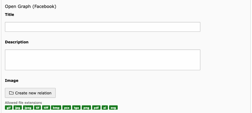
- Title
The title to be displayed on social media relying on Open Graph, i.e. Facebook.
- Description
The description text to be displayed if you enter the page’s URL into social media using the Open Graph, i.e. Facebook.
- Image
You may choose a specific image to display when this page is linked to in social media.
Metadata Tab

- Abstract
A short summary of your page’s content
- Keywords
Keywords for you page
- Author name
You may add an author for this page.
- Author email
The author’s email address.
- Last Update
If you want your visitors to keep track of updates to your page, you can enter a date here.
This date is not automatically updated, you have to edit it yourself when using it.
Appearance Tab
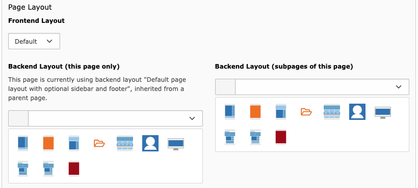
- Backend Layout (this page only)
The layout for the page you are editing.
- Backend Layout (subpages of this page)
The layout chosen in this field will be applied to all future subpages of this page that you'll create.
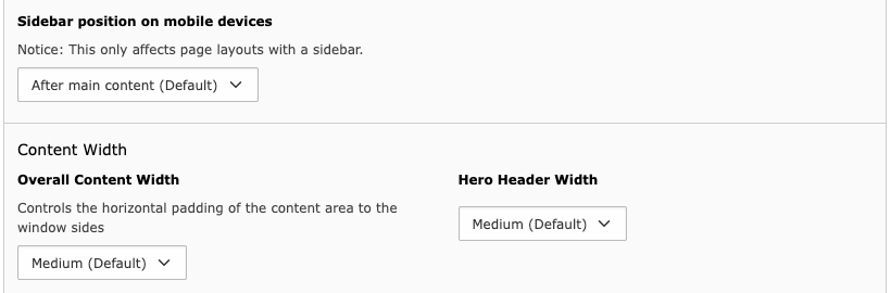
- Sidebar position on mobile devices
On devices with small screens like smartphones, the sidebar is not shown aside the main content to make room. By default, it is shown below the main content instead.
With this option, you can display the sidebar before the main content if desired.
Note that the table of contents is not affected by this control, since it will be displayed as a collapsed menu right after the hero section on small devices.
- Overall Content Width
There are three width settings for the content area (4 & 5 on default layout):
- Medium (Default): the main area is a bit narrower than the primary navigation
- Narrow: the main area is noticably more narrow, about 70 % of the window width. This is used on news article views, for example
- Wide: the main area has the same width as the primary navigation row
- Hero Header Width
Same as above, but concerning the hero section.
Behaviour Tab

- Link target
Specifiy whether the page should be opened in the same window (default) or in a new tab/window.
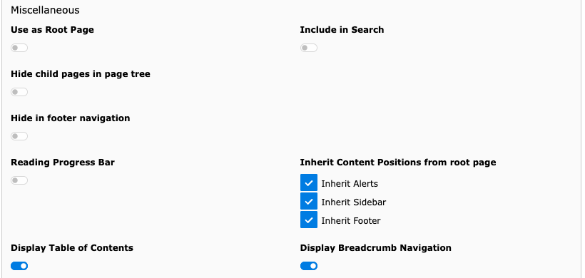
- Use as Root Page
This will turn your current page to a main landing page in the page tree.
- Include in Search
If unchecked, this page will be hidden from search engines.
- Hide child pages in page tree
If checked, the child pages of this page will not be shown/collapsed in the backend’s page tree.
- Hide in footer navigation
This will hide the page in the footer menu.
This option is marked as deprecated since using the large bottom menu was dropped.
- Reading Progress Bar
This will show a thin green line below the main navigation that gets longer as you scroll farther down, giving a clue about your reading progress.
This is used by default for news articles, for example. It is also active on this page.
- Inherit Content Positions from root page
Select which section’s content element should be repeated from the parent or root page.
- Display Table of Contents
By default, the system will use your headings to generate a table of contents of your page. If this functionality is not desired on your current page, uncheck this option.
For more information on link rendering in the table of contents, check the Headlines documentation.
- Display Breadcrumb Navigation
Uncheck this control if you don’t want the Breadcrumbs navigation (Root » Parent page » Current Page) on top.
Access Tab
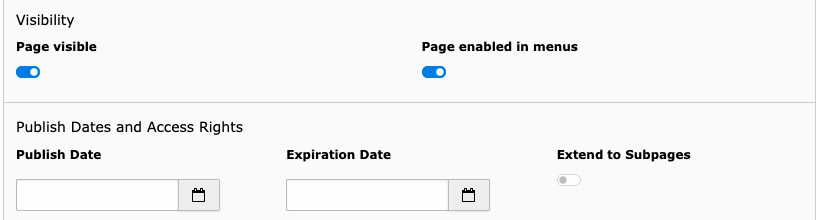
- Page visible
You can use this control to hide the page or select its visibility in the list module.
- Page enabled in menus
Use this field to hide pages in navigation menus, if you don’t want direct access to it.
This is used for single news article pages as they would stay blank if accessed without following the link to a specific article.
- Publish Date
You may set a date for the page to be published.
- Expiration Date
When an expiration date is set, the page will be unpublished at this date.
- Extend to Subpages
The date behaviour can be extended to child pages.