
Page Layouts
Default Layout
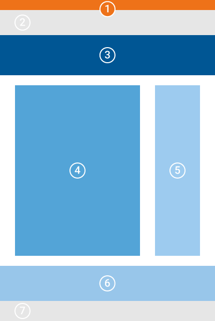
The default layout is the most used page layout, featuring all you need for the usual tasks.
Besides the main content area, it features a large header section, a sidebar, and a footer – all of them optional, they will appear once you put a content element in them or if they inherit elements from its parent pages. The hero must be activated in the page configuration, but it is visible by default.
Alerts will appear here, right on top of the page.
However, as this position is not often used, the content area was positioned below the other sections on the layout page.
TUM-Logo and Primary/Secondary Navigations.
This section can only be edited by super administrators.
This full size section contains the breadcrumbs path menu, title, subtitle and a header image, if set.
The section is customizable and can also be completely deactivated.
This is where the main contents of the page are shown. The contents are put together by using content elements.
An optional sidebar where you can put additional navigation or information like contact persons.
If set in the page properties, the sidebar will also be populated by the table of contents and elements inherited from parent pages. The table of contents will always be on the top of the column.
A bottom row for additional contents. Works well with the Equal Columns Container Element.
This can only be edited by super administrators and will appear on all pages.
Error Page Layout
The error page layout is reserved for error pages like the 404 information. It is not recommended to be used.
If you want to use it anyway, you'll get a layout with a hero and a content area. The page in the frontpage will feature an animated fermenter left of the content area.
Extended Header Layout
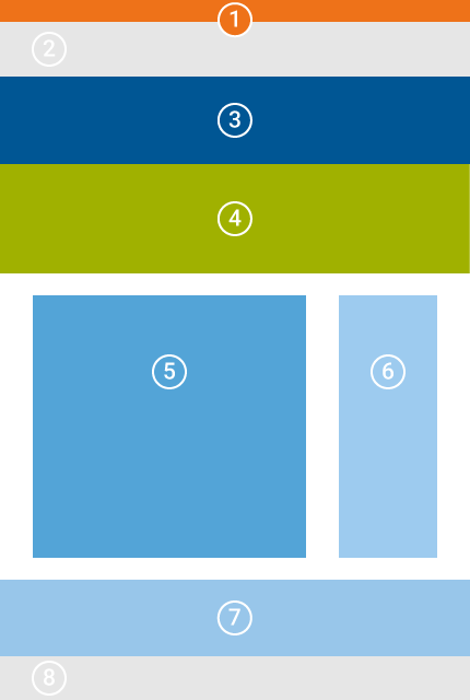
The extended Header Layout is the same as the Default Layout with the addition of a full width section below the hero.
Use it if you want a full size slide show or banner image.
Folder Layout
This layout was created specifically for folders in the page tree. Its main objective is to prevent user from mixing up folders and pages and unintentionally layouting them.
The folder Layout features one content position called Repository. This enables you to store content elements you want to use elsewhere, like in news or references on multiple pages.
Landing Page Layout
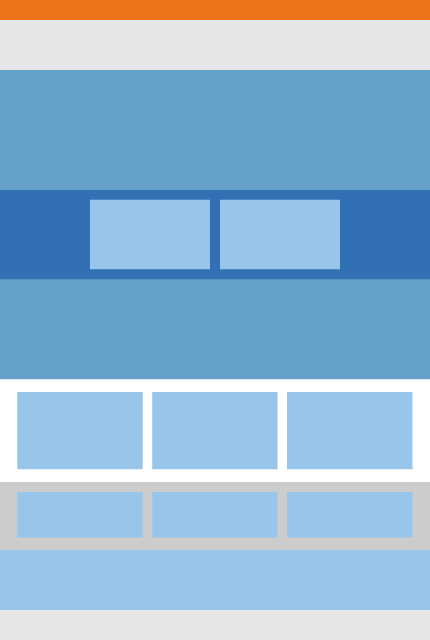
This layout has an abundance of content positions that make it really a mess on first sight.
It should only be used for the TUMCS main landing page. Be nice to yourself and do not use it :-)
Person Layout
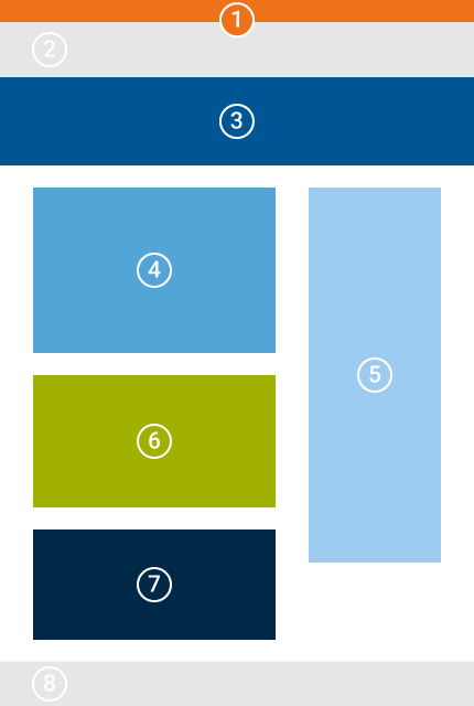
This might be the only other layout you'll ever need. It is designed specifically for rendering a single person’s information.
It features special positions for the personnel data object reference, an accordion and publications.
This area is for an introductory text, like a short verbose summary of the vita.
Create a reference to the person’s data object using the Personnel Selected Content Element here.
Hide the Heading and set the element’s layout template to Single person page element for correct display.
Whatever you put here will be rendered as part of an accordion, using the element’s title as header. Using this area is a neat and tidy way to display different listings like awards, education, professional experience etc.
This area works really well with List Container content elements.
Originally an area for a publication list drawn from mediaTUM, after TUM’s transition to TUMFIS this section can still be used if you want to display anything below the accordeon.
The Others
There are four additional layouts:
- Infoscreen
- Study Program Overview
- Study Program
- Christmas
These are built for a specific use, please do not use them on department websites.
Unfortunately, I cannot hide these layouts from default users.